

Role
Product Designer. Research, UX/UI, design system and front-end on WordPress. Sole designer
Team
Marketing Director and the company’s CEOs, at a startup of about 20 people
When
2022 – 2024
Status
Launched. Live for three editions, and the base for two more products.
The problem
When I joined Finnovista, its events unit had a logo and nothing digital. Every year, Finnosummit’s agenda went out as a PDF.
That works for a small meetup. It doesn’t for two days, more than 2,000 attendees from 26 countries and 119 speakers. During the event, people want to know what’s next, who’s speaking and who’s worth meeting. With a PDF, that meant searching your inbox on your phone between sessions.
For the business, the event had no place online either: no page to sell tickets, show the lineup or make the case for coming.

2,000+
attendees from 26 countries, and one PDF to find their way
What I found
Finnosummit surveyed attendees after every edition, and the answers kept pointing at the same gap: people wanted the agenda somewhere they could reach, not an attachment they had to find. I benchmarked event agendas to see how others organized days, sessions and speakers.
Two things shaped the design.
People come for the networking. Attendees are CEOs, CTOs and directors from fintechs and banks, so the agenda is how they decide where to be and whom to meet. Each session had to show who at a glance, not only what.
The agenda is used on the go.
It gets opened on a phone, standing in a hallway between sessions. Scanning by time mattered more than reading.

119
speakers across two days
countries in the audience
held the whole program, sent by email
Who the agenda was for: people who come to meet each other.
Fintech founders and CEOs
The core audience. They come to find partners, investors and clients, so they need to know who is speaking, and when.
" width="76.10411111111118px"><path d="M 0 37.998 C 0 17.012 17.036 0 38.052 0 C 59.068 0 76.104 17.012 76.104 37.998 C 76.104 58.984 59.068 75.996 38.052 75.996 C 17.036 75.996 0 58.984 0 37.998 Z" fill="rgb(6, 80, 90)" height="75.99585488646986px" id="xXxexpZiI" transform="translate(0 0)" width="76.10411111111112px"/></g><path d="M 0 11.039 C 0 4.942 4.949 0 11.055 0 C 17.16 0 22.11 4.942 22.11 11.039 C 22.11 17.136 17.16 22.078 11.055 22.078 C 4.949 22.078 0 17.136 0 11.039 Z" fill="transparent" height="22.078475106685215px" id="Jv5Gqh0fm" stroke-linecap="butt" stroke-linejoin="miter" stroke-miterlimit="10" stroke-width="1.57" stroke="rgb(247, 247, 247)" transform="translate(44.775 20.492)" width="22.10992592592617px"/><path d="M 0 11.039 C 0 4.942 4.949 0 11.055 0 C 17.16 0 22.11 4.942 22.11 11.039 C 22.11 17.136 17.16 22.078 11.055 22.078 C 4.949 22.078 0 17.136 0 11.039 Z" fill="transparent" height="22.078475106685215px" id="C0_Siy2OT" stroke-linecap="butt" stroke-linejoin="miter" stroke-miterlimit="10" stroke-width="1.57" stroke="rgb(247, 247, 247)" transform="translate(72.641 20.492)" width="22.109925925926163px"/><path d="M 16.748 0 C 14.528 2.218 11.515 3.465 8.374 3.465 C 5.233 3.465 2.221 2.218 0 0" fill="transparent" height="3.4648700846343203px" id="W4LBcxFto" stroke-linecap="round" stroke-linejoin="miter" stroke-miterlimit="10" stroke-width="1.57" stroke="rgb(247, 247, 247)" transform="translate(62.046 61.292)" width="16.748111111111058px"/><g fill="transparent" height="55.81983634312434px" id="f8YsULEr4" transform="translate(1.098 81.403)" width="139.2951351476569px"><path d="M 129.474 55.82 C 135.493 55.82 140.494 50.879 139.041 45.047 C 138.118 41.369 136.757 37.814 134.988 34.458 C 131.434 27.686 126.225 21.532 119.657 16.349 C 113.09 11.165 105.293 7.053 96.714 4.249 C 88.131 1.444 78.935 0 69.647 0 C 60.359 0 51.163 1.444 42.583 4.249 C 34.002 7.054 26.205 11.165 19.639 16.349 C 13.072 21.532 7.862 27.686 4.308 34.458 C 2.539 37.814 1.177 41.369 0.254 45.047 C -1.199 50.879 3.804 55.82 9.821 55.82 L 129.472 55.82 Z" fill="rgb(6, 80, 90)" height="55.81983636839115px" id="bvH2umoD2" transform="translate(0 0)" width="139.29513514764253px"/></g><path d="M 23.684 0 C 23.685 3.95 21.711 7.639 18.422 9.833 C 15.133 12.028 10.964 12.437 7.31 10.925 C 2.886 9.095 0 4.784 0 0.001" fill="transparent" height="11.82609031204888px" id="Es1udU1pg" stroke-linecap="round" stroke-linejoin="miter" stroke-miterlimit="10" stroke-width="1.57" stroke="rgb(247, 247, 247)" transform="translate(58.467 86.182)" width="23.68375963575683px"/><path d="M 4 0 C 6.209 0 8 1.791 8 4 C 8 6.209 6.209 8 4 8 C 1.791 8 0 6.209 0 4 C 0 1.791 1.791 0 4 0 Z" fill="transparent" height="8px" id="hGjur_Jbz" stroke-dasharray="0" stroke-linecap="butt" stroke-linejoin="miter" stroke-miterlimit="4" stroke-width="1" stroke="rgb(247, 247, 247)" transform="translate(66 103)" width="8px"/><path d="M 4 0 C 6.209 0 8 1.791 8 4 C 8 6.209 6.209 8 4 8 C 1.791 8 0 6.209 0 4 C 0 1.791 1.791 0 4 0 Z" fill="transparent" height="8px" id="eIjRlp_2w" stroke-dasharray="0" stroke-linecap="butt" stroke-linejoin="miter" stroke-miterlimit="4" stroke-width="1" stroke="rgb(247, 247, 247)" transform="translate(66 115)" width="8px"/><path d="M 4 0 C 6.209 0 8 1.791 8 4 C 8 6.209 6.209 8 4 8 C 1.791 8 0 6.209 0 4 C 0 1.791 1.791 0 4 0 Z" fill="transparent" height="8px" id="yp2PnCVeG" stroke-dasharray="0" stroke-linecap="butt" stroke-linejoin="miter" stroke-miterlimit="4" stroke-width="1" stroke="rgb(247, 247, 247)" transform="translate(66 128)" width="8px"/><path d="M 0 0" fill="transparent" height="1px" id="kKBxLIkuP" stroke-dasharray="0" stroke-linecap="butt" stroke-linejoin="miter" stroke-miterlimit="4" stroke-width="1" stroke="rgb(170, 170, 170)" transform="translate(70.5 49.5)" width="1px"/></svg>)
Technology leaders
Directors and managers from fintechs, choosing which sessions are worth their time.
Traditional banking
Managers and directors from banks, there to meet the fintechs they might partner with.
Three decisions
01
Decided: break the agenda into days, and each day into session cards with the time and the speakers. A tap opens the session: its description, the full list of speakers and a link to each one’s LinkedIn.
Why: attendees don’t read an agenda, they check it. The question is always “what’s next, and who’s in it”. Day tabs answer the first part; the speakers on the card answer the second. The LinkedIn links and the connection to Brella, the event’s networking app, turned the agenda into a networking tool.
Discarded
Putting the PDF online, or one long page with the full program.

1 · Speakers on the home

2 · The agenda, day by day

3 · A session and its speakers
02
Decided: build Finnosummit’s foundations from Finnovista’s brandbook (color range, typography, how components are built) and give the event its own layer on top. The first site ran on Finnovista’s WordPress, reusing its components, with a custom CSS layer I build that carried the event’s identity.
Why: Finnosummit had to read as the brand’s event: not as the brand, and not as someone else’s event. Shared foundations kept it in the family; its own layer let it stand on its own. Building on what the company already had meant one person could ship it.
Discarded
Reusing Finnovista’s look as it was, or a standalone identity with no tie to the parent brand.

Parent brand · Finnovista

Events · Finnosummit
Fund · Finnovista.vc
03
Decided: give Finnosummit Connect (2023), a smaller event for senior leaders in Cancún, its own identity and its own site, still recognizably Finnosummit, built on the same components, type and structure.
Why: Connect was selling something different: fewer people, higher level, better networking. With the same look as the big event it would have read as more of the same, with no room for premium elements. The difference lives in the theme (color, imagery, tone); the structure attendees need (speakers, agenda, tickets) stays the same.
Same speaker detail, two events: the structure stays, the theme changes.
Discarded
Running Connect under Finnosummit’s existing identity. It was what the CEOs first wanted.

Finnosummit 2023

Finnosummit Connect 2024
The result
Finnosummit went from a logo and an emailed PDF to a website with a digital agenda, connected to Brella. Every attendee got the agenda link, and the landing was where the ticket campaigns sent people to buy. It went live months before each event and stayed up through it, in 2022, 2023 and 2024. At the venue, I watched attendees check it on their phones between sessions.

Three products, one system. Each home page was designed and built on WordPress; scroll inside each frame to see the whole page.
Finnosummit · 2022
The flagship event, and where the system started: the landing that sold the event and the digital agenda.

Finnosummit Connect · 2023
The premium event in Cancún. A new theme on the same components.
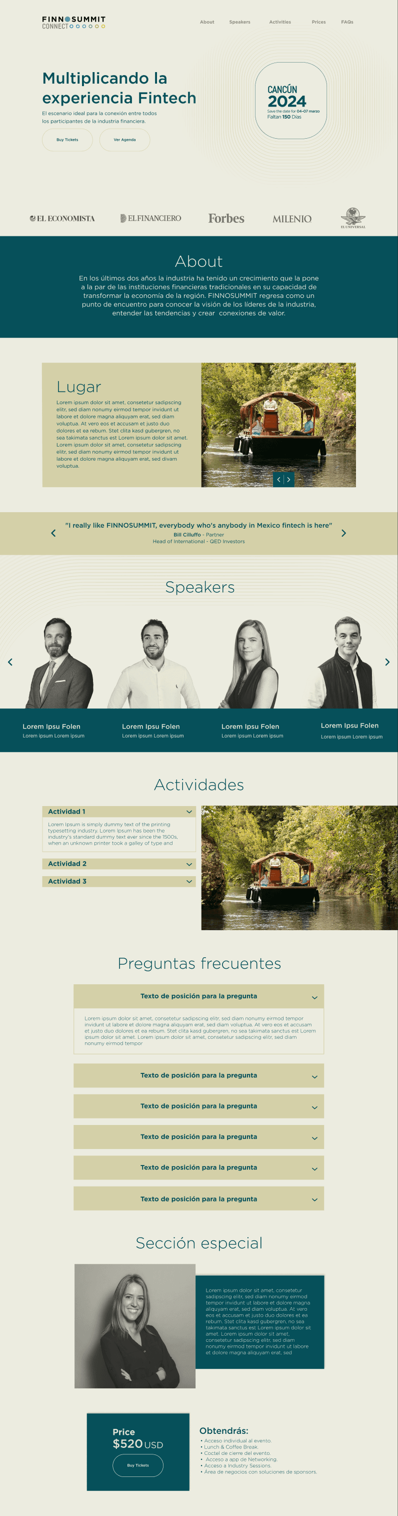
Finnovista.vc · 2024
Not an event: Finnovista’s venture capital fund. The system’s first product outside Finnosummit, built for fintech founders instead of event attendees, on the same foundations.

Two events and a venture fund from one system: Finnosummit (2022), Finnosummit Connect (2023) and Finnovista.vc (2024), each with its own identity and documented in its own brandbook. One designer behind all of it.
Design system
Shared foundations, a theme per product, and a brandbook documenting each one
FOUNDATIONS
Color
Cian oscuro
#06505A
Shared by both events: text and dark surfaces
Summit green
#01E094
Finnosummit: gradients and highlights
Mint
#39F2CD
Finnosummit: session cards
Beige medio
#D4D0A8
Connect: lines and details
Beige arena
#ECECE0
Connect: backgrounds
Azul neutro
#3C96FF
Finnovista.vc: primary
Typography
Gotham
Bold · Medium · Book
Display · Bold
Title · Medium
Tendencias globales en América Latina
Body · Book
Industry session · 9:20 am – 10:00 am
Label · Bold
Speakers principales
Brand architecture
Documentation
One brandbook per product, written and maintained by me: logo architecture and use, color, typography, photography and supporting graphics. Leadership had them as the reference for every new piece.
Finnosummit Connect 2024 and Finnovista.vc brandbooks.
COMPONENTS
Navbar
Ver agenda
A glass bar over the hero. The action follows the page: Ver agenda on the home, Home on the agenda.
Buttons
Buy tickets
Ver agenda
Brella
Primary, secondary and outline. Primary sells, secondary navigates, outline goes out to Brella.
Agenda controls
26
Martes
27
Miércoles
Filtrar y ordenar
One tab per event day, plus filter and sort for a two-day program.
Session card
Industry session
Inauguración
9:00 am – 9:20 am
Industry session
Main content
Tendencias globales en América Latina
9:20 am – 10:00 am
Main content
Speaker card · Finnosummit, and Finnosummit Connect

Pierpaolo Barbieri
Founder at Ualá
Photo on the event gradient, name and role. A tap opens the speaker’s detail and LinkedIn.

Nombre y Apellido
Country Manager
Same structure, premium theme: black and white on dark cyan, name on a solid band.
Ticket card
$5,400
• Acceso completo al evento y agenda de 2 días
• Oportunidades de networking de alto nivel
Buy tickets
Price, what’s included and one action. The landing’s whole job in one card.
Stat tile · three themes
Finnosummit
+1700
Asistentes de 26 países
Finnosummit Connect
CANCÚN
2024
Faltan 150 días
Finnovista.vc
42
Fintech investments across LATAM with our Fund I
Same job in each product: a big number and a short label. Connect’s version is the countdown to Cancún.
Every page in this case is assembled from these pieces, dressed in each product’s theme. Gotham appears here in Montserrat, its closest web font.
What I learned
This was the project where I understood what technology could do. The event industry still thought in artifacts like a PDF agenda. Taking it digital made the same information more accessible, easier to use and more satisfying: the program in your pocket, the speakers one tap away, the people you wanted to meet already linked. That’s when I fell in love with building digital products, and it’s still what I look for: the thing everyone accepts as “how it’s done”, waiting to become a better experience.